I hate when things that were working perfectly fine suddenly change their design. Sometimes it really feels like there is a whole department of designers sitting in companies with nothing to do and so they decide to redesign something that already works just to seem useful.
Most people probably experienced this at least once. You open your favorite app, website or game and suddenly everything looks different. Buttons moved somewhere else, menus are hidden, colors changed and now simple actions that you memorised and "automated" take longer. Very often players react negatively to those updates, even if the redesign was technically "better."
There is actually a lot of research showing this effect. Many product teams know that users usually dislike major UI changes at first. Some studies show that people need days or even weeks to adapt to a new interface. In word games and apps, sudden redesigns often reduce engagement because players simply feel uncomfortable using something that used to feel familiar.
That is why when we decided to give Smartle daily word puzzle an updated look we knew immediately that we did not want to go for a full redesign. Our main goal was to keep our existing players happy. Attracting new players who discover Smartle through searches like daily word games, daily word puzzles, or word games free is important too, but still secondary.
For us it was very important that the game would still look and feel like Smartle. We only wanted to improve things that long-time players would instantly recognize as obvious improvements.
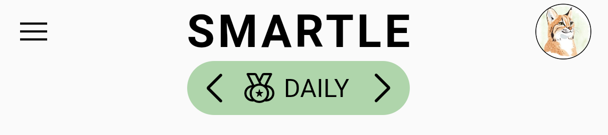
The first improvement was changing the way players switch between different game modes. Smartle currently has three modes overall: Daily word puzzle, Sprint and Archive mode where players can play past daily games.
In the older version, switching between these modes worked through arrows located below the Smartle logo. Players had to click left or right arrows and cycle through the modes one by one in a loop. It worked, but it was not always very clear, especially for new players trying the daily word game for the first time.
In the improved version we introduced three visible tabs. Now players can immediately see all available word game modes at a glance and just click the one they want to play. It sounds like a small change, but small usability improvements often make the biggest difference in free word games because players can focus on gameplay instead of figuring out navigation.
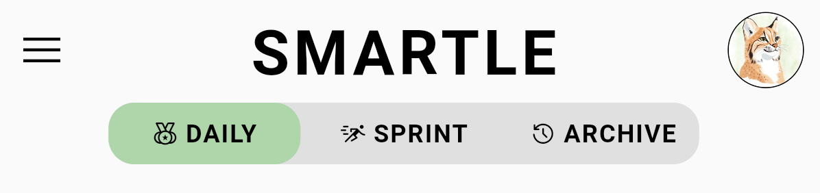
We think this update feels much more natural while still keeping the original Smartle identity intact.
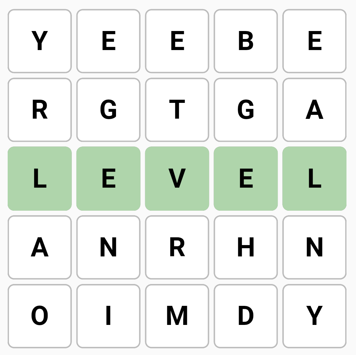
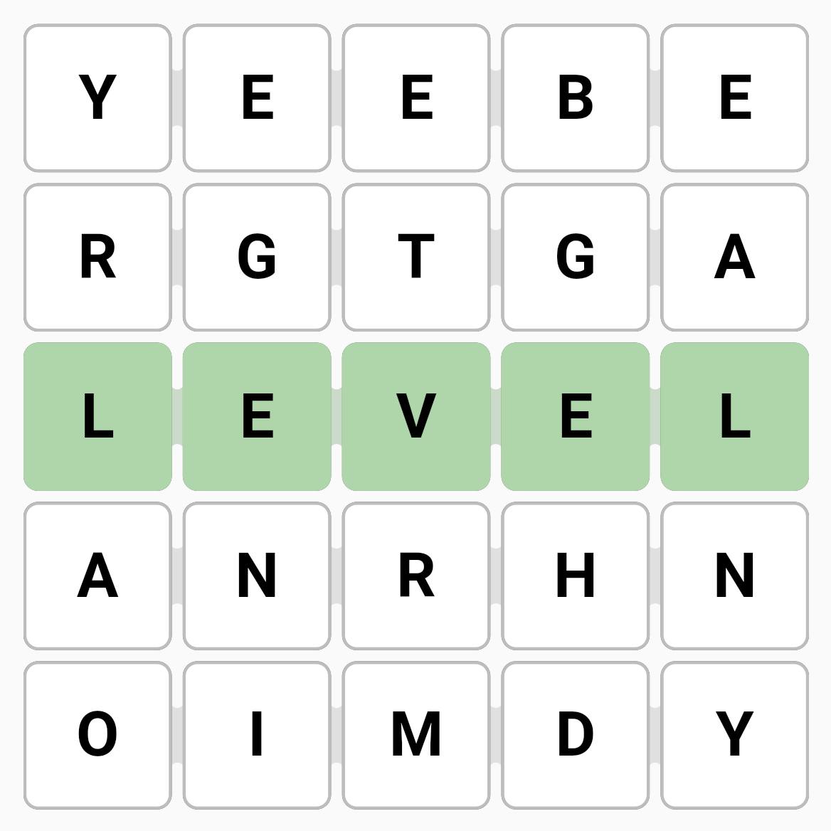
Another important improvement for the daily word puzzle was how correctly found words are highlighted.
We quite often received feedback that it was unclear that words should only be created horizontally. This confusion appeared especially often among new players discovering Smartle as one of the free word games online. They tried to create a correct vertical word but the game was not accepting it.
Because of this, we decided to improve how our playing field works and make the correct word direction more obvious. Now highlighted words communicate the direction much better and the gameplay feels easier to understand without needing additional explanations.
Actually this is another common design lesson in many daily word games: players usually prefer interfaces that explain mechanics visually instead of through long tutorials. If players understand the rules naturally while playing, they are much more likely to continue playing and return the next day.
We believe Smartle should continue evolving carefully in this direction. Improving clarity and usability while keeping the familiar feeling that existing players already enjoy.
Sometimes the best redesign is the one that players barely notice at all. What do you think?
By the way, we now - after almost 4 years - got a proper website for our game dev studio. It has the game catalog with all of our games as well as our studio's blog. You can check it out here.